Brand & Web Design | Kelsey Perkins Photography
Kelsey came to me wanting a brand and website design when she was going through a transition in her photography business. She was putting more time and effort into her craft and was ready to take her business to the next level. She needed a brand and website to showcase all this work. This is such a perfect and fun time to design for someone. The client has lots of ideas floating around, but everything still feels fresh and new. I loved taking all of Kelsey's ideas, organizing and transforming them into a tangible brand. A brand that is representative of her photography, but that can continue to evolve and grow as her business does. This new brand and website is one that I am proud to add to my portfolio. Today I'll show you all the lovely details of the design and walk you through the design process a bit!
When Kelsey and I first started talking about her design we talked a lot about her photography style. Her photography is unique, untraditional, artistic, and candid. The images definitely stand on their own and we didn't want to distract from them. We decided that simplicity is key. She used words like clean, moody, modern, simple, and different to describe her ideal brand. I kept that important vision in mind as I pulled images for the Kelsey Perkins Photography inspiration board. From the items Kelsey had pinned to our shared pinterest board, I chose pictures that felt natural and moody. She was drawn to a fairly neutral palette, with small accents of greens, purples, or blues.
With Kelsey on board with the design direction, I then got to work conceptualizing the brand and drafting logo options. The logo concept that she chose features hand-drawn watercolor leaf accents paired with her name in my calligraphy handwriting. Simple, elegant, modern, and classic. We both agreed this option looked the most professional, best represented her fine-art photography, and had the most potential for brand-longevity.
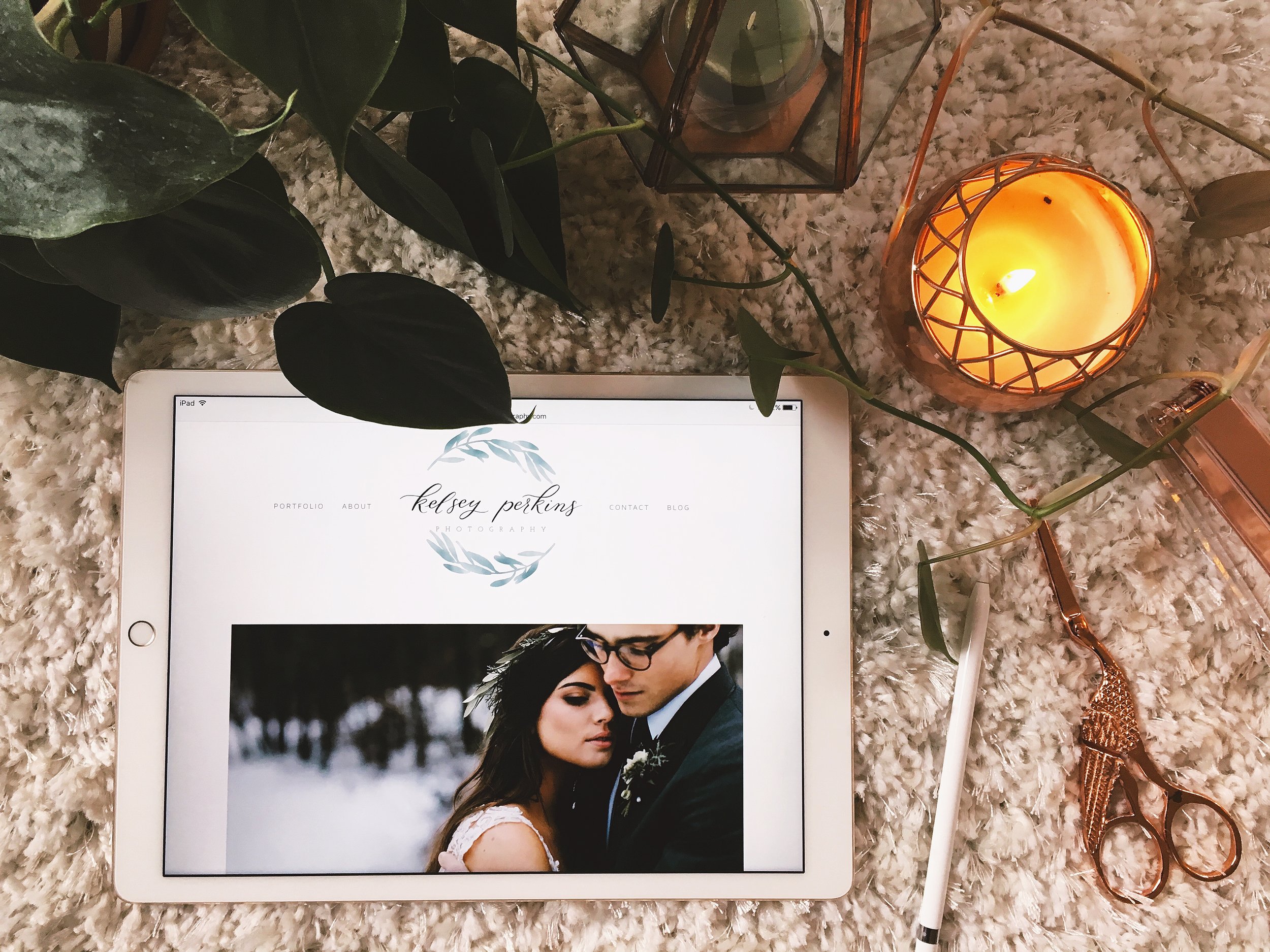
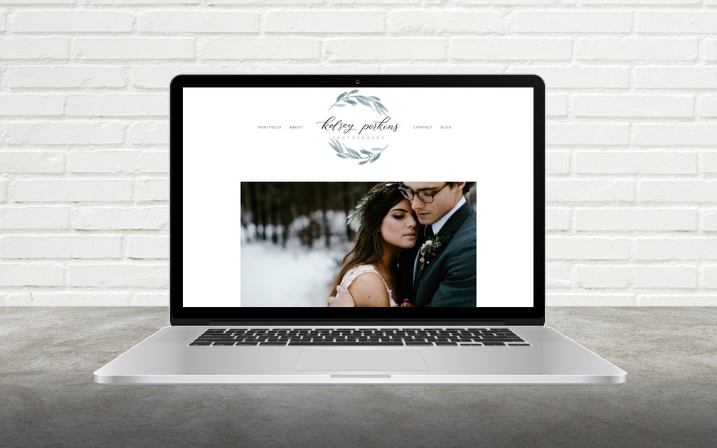
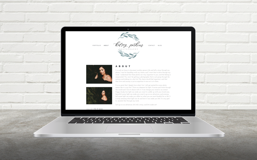
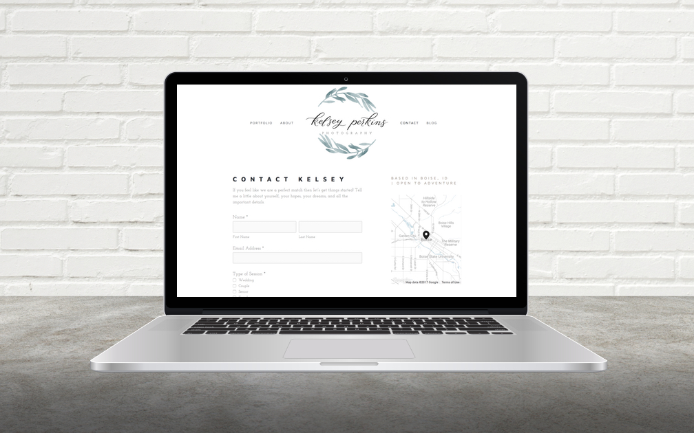
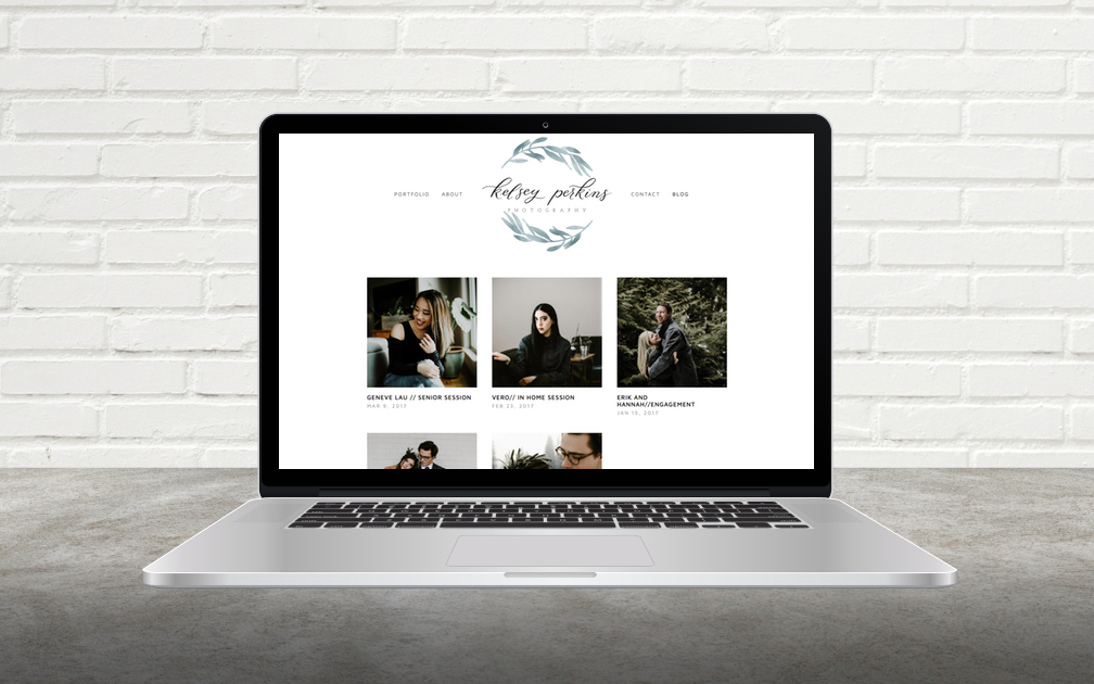
Now that both the brand style board and the logo were in place, the website was simple to design! I kept things very clean and bright and neutral, as Kelsey wanted, to heavily feature her photographs. Easy flow and navigation were the most important goals. She wanted the website to be a gateway to her blog, where you are able to really dive into her work. The website really feels like a “store front,” inviting and simple; drawing the shopper into the store. The new website design achieved all of Kelsey's goals: there isn't any clutter taking away from the photography and every page feels fresh, clean and professional.
The slideshow of screen-shots above, from Kelsey Perkins Photography's website, don't do it justice! Head on over there to see the whole thing in action, meet Kelsey, and browse through galleries of beautiful and inspiring photography!
I also designed some business cards for her to print and use.
Working with Kelsey on this project has been a dream! Most of all, I'm am thrilled that Kelsey is pleased with the final outcome and now has a beautiful brand and website that reflects and showcases her photography!
Interested in working with me for the design of your brand and website? Visit my Design Services page for more information, my Portfolio to see more of my work, and the Contact page to get in touch!
